Where it started
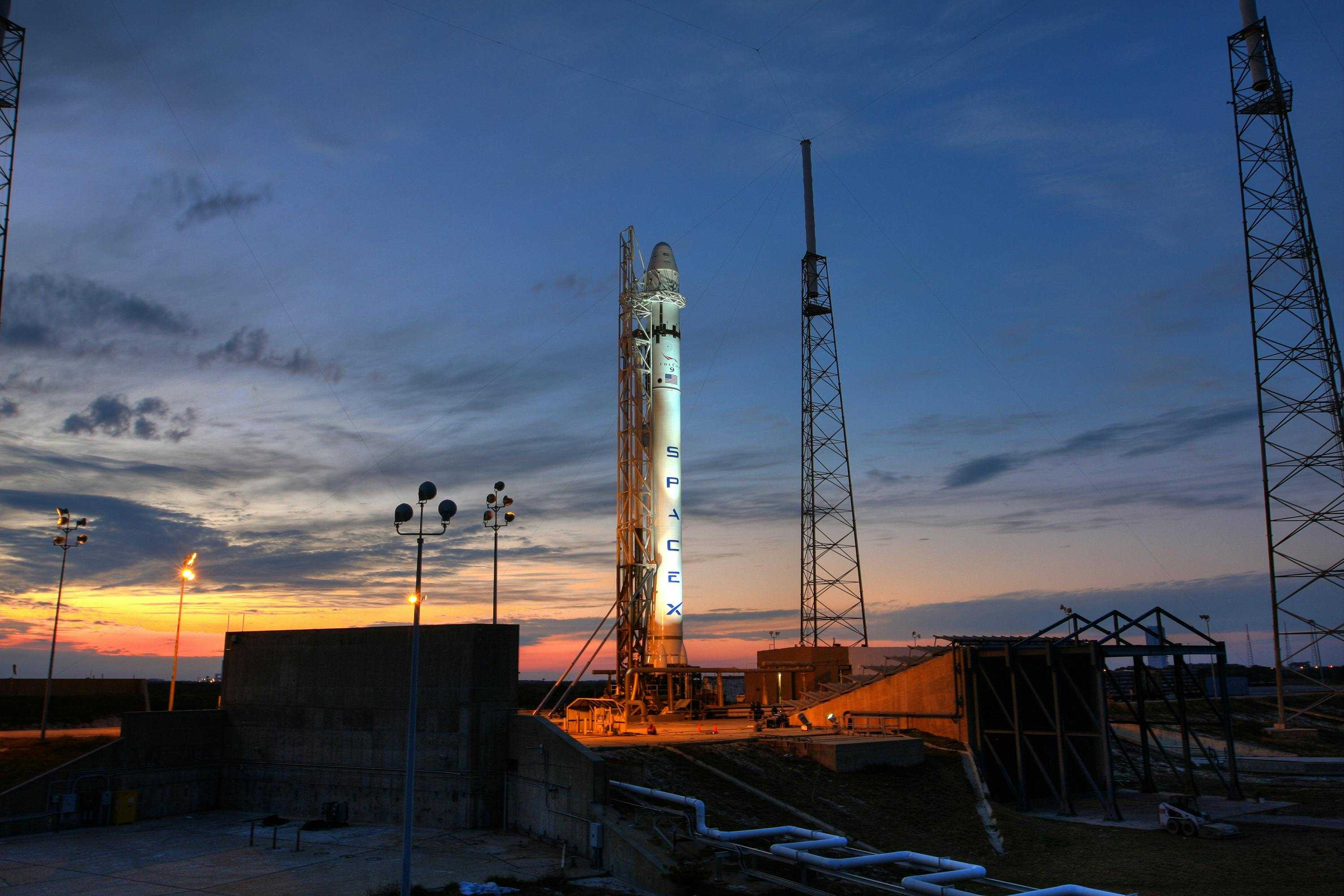
Moonwalk is a passion project for space fans, helping users track upcoming rocket launches and stay updated on related news. The previous version (V4) was fully functional but built with native iOS conventions, default fonts, stock components, and a lot of in-page navigation. While it worked technically, it lacked personality and a clear sense of identity.
Our goal was to design a brand and UX that felt distinct, intuitive, and worthy of the passionate community using it.
Designing the brand
We started with a new logo and visual direction. The logo features a clean moon shape with a surrounding orbit circle. We played with line weight and shadows to evoke movement, referencing both Earth and its satellite (the Moon). It needed to function well as both an app icon and a standalone logo.
![[Fig.1] Moonwalk new logo.](/static/30498830ca20e91f70b34ef692762e5b/21b4d/logo.png)
![[Fig.2] Moonwalk app icons.](/static/b436eebdf9a5e0b5e6b42a4990fee900/79152/appicons.jpg)
![[Fig.3] Merch mockup.](/static/340486ff7f449512ab52478ec3538812/79152/mockup.jpg)
The color palette draws directly from real space imagery: rust-toned shades, deep space blues, muted neutrals. We wanted it to feel clean and a little futuristic, while still looking cohesive with the iOS ecosystem.
![[Fig.4] Moonwalk color palette.](/static/c2e81504982d21a3be0ade91524f13f0/eea4a/colors.jpg)
![[Fig.5] Moonwalk typeface system.](/static/085391801793e819e8ae779cfb4d2665/21b4d/fonts.png)
Rebuilding the UX around what matters
Learning from our mistakes
The previous UX leaned heavily on bottom sheets and layered views. There was no persistent navigation, and important information like live countdowns was hidden behind multiple taps. This made it hard to build a consistent mental model of the app and often buried key launch information behind multiple taps.
- Hard to navigate
- Lack of hierarchy
- Lots of unused space
Moonwalk pulls data from the SpaceDev API, which provides plenty of information about launches — location, timing, mission type, vehicles, agencies, and more. Yet much of this data wasn’t being surfaced effectively. Our challenge: show as much meaningful information as possible without overwhelming the user.
![[Fig.6] Screenshots from the previous Moonwalk version.](/static/8ef66b754655f88b1be358bb02e1b400/21b4d/before.png)
Adding persistent navigation
We restructured the app around a simple tab bar to give users easy access to key content: the launch calendar, live events, past launches, and news. This change dramatically improved discoverability and reduced friction. It also helped users understand the scope of content available.
Re-designing the launch card
Between frequent last-minute updates, changing weather, and critical timing for livestreams, rocket launches are unpredictable. The launch card became our most important UI element. We redesigned it with a few guiding principles:
The checklist:
- Make the countdown the visual anchor so users never miss the launch window.
- Use visual variants to signal status (upcoming, delayed, completed, etc.)
- Maximize utility in minimal space
![[Fig.7] Launch card variants.](/static/f2d5c950bc2059f741bcd9aaf2f0076a/21b4d/launch-card-variants.png)
Contextual insights: real-time weather for every launch
While we were limited to the data and information available in the Space Dev API, we wanted to go a bit further. Because we had launch locations, we integrated Apple’s WeatherKit to show local weather conditions for each launch site. Weather plays a huge role in rocket launches — so giving users this context made the experience more informative and immersive.
We designed a custom weather widget using gradients that aligned with our color palette. Each weather type had a distinct visual identity, built from Apple’s documentation and tailored to the Moonwalk aesthetic.
![[Fig.8] New custom weather widget.](/static/a062f506f9b35a04ec40552bdec93c5d/21b4d/weather-widget.png)
![[Fig.9] Snapshot from the launch screen.](/static/79463420db5825f3a9d404cd94c00b60/129e9/launch-screen.png)
![[Fig.10] Snapshot from the agency screen.](/static/992c80057354f1ed8be384bc1fb87bba/129e9/graph.png)
The result
My partner implemented analytics shortly after launch. While we’re still collecting long-term data, early results are promising and more importantly, feedback from our peers has been overwhelmingly positive: the app now feels clearer, faster, and more informative — exactly what we set out to achieve.
This project taught me a lot about working with real-time data, designing for edge cases (like scrubbed launches), and finding clarity within complexity.
Download the app today!
We’re still actively improving the app — so if you’ve got thoughts, we’d love to hear them!
![[Fig 5.] Moonwalk home before and after.](/static/daa72ef3ea93e0cc0c4394cc95b96897/21b4d/before_after.png)
